Vivaldi – A New Browser for our Friends
• filed under software • permalinkSo there’s a new browser in town, put out by ex Opera big cheese Jón Stephenson von Tetzchner. It’s called Vivaldi and so far, it looks just as good as Vivaldi’s music sounds.
Vivaldi came to be after coming to the conclusion that Opera (the browser) just ain’t what it used to be. According to the site: “[Opera] is no longer serving its community of users and contributors who helped build the browser in the first place.” That’s a bummer. I liked Opera for a while, but then it started feeling super fat. It started feeling like Firefox. For what it’s worth, at the time, all third party browsers were feeling super bloated like they needed to have extra water drained out of them.

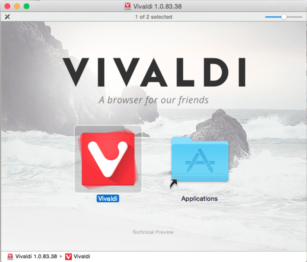
I downloaded it just now and toyed around with it for a bit. Obviously, on a Mac, installing an app is simple to the point of condescension in most cases. Just drag and drop it into the Applications folder.

On launch, there’s not much going on. Once you start browsing sites, it’ll do what other browsers do and show you your most visited sites. The UI is flat and clean. It blends super well with the UI theme that OS X Yosemite carries, and doesn’t feel out of place. The tab idea must really be working with users because it seems quite similar to just about every other name brand browser out there, which is fine. There’s no sense in reinventing the wheel if your existing wheel is super fast.

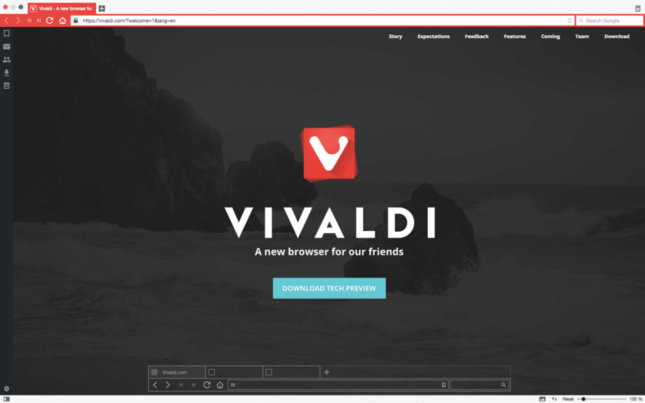
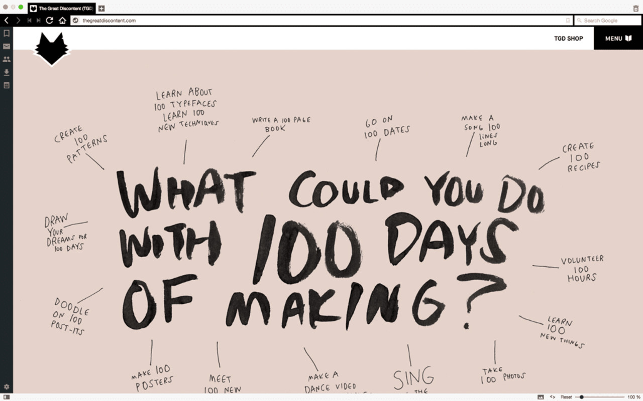
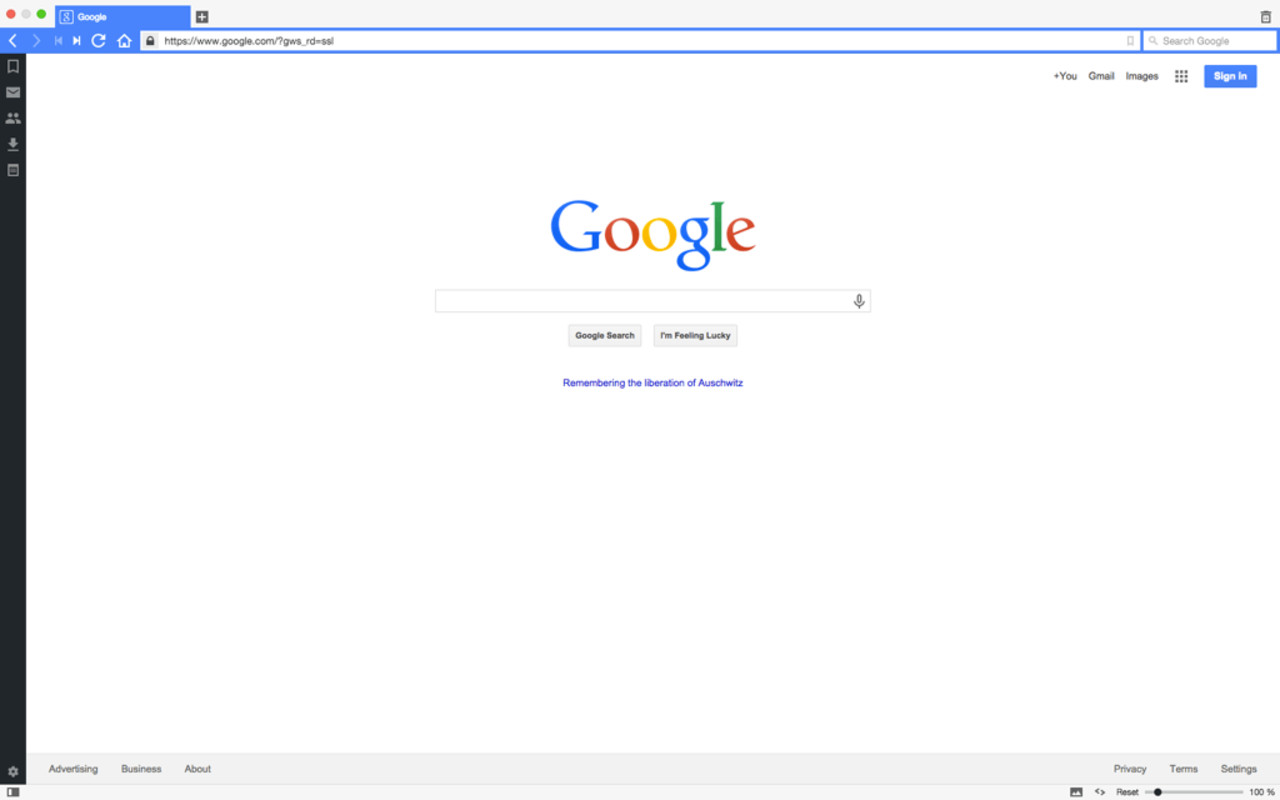
After launching a few sites, I noticed a really cool trend. The site icon that appears in the tab dictates the UI’s main color. The Vivaldi has a mostly red icon ergo the UI is the same shade red. Visiting The Great Discontent changes the UI to black, and Google to blue. It’s a subtle touch but is much appreciated. It takes the branding of the site the user is viewing and extends it over their whole screen. It’s almost as if the brand bleeds into the whole browsing experience.

There are a load of cool features coming soon, according to the Vivaldi Web site including:
- Mail. What’s better than a really good competitor to Gmail? Who says they have to eat all the cake?
- Bookmark/Notes/History/Session syncing across different devices. Smells like a hint that mobile will be a real thing.
- Keyboard-based (Spatial) Navigation. Sounds like it could be good. Will have to wait and see how this turns out.
- Performance Boosts. Nothing like a snappy quick browser. Even being slightly cracked out is OK, so long as it’s stable.
- Extensions. Your browser needs to do so much more these days and they want to make sure that happens in the most secure method possible without impacting performance.
- And More… They’re taking suggestions from the community!
Download: Vivaldi.net
I’m looking forward to seeing what this baby can do, especially with the upcoming release from Microsoft of their new “Spartan” browser!